Firstly, I uploaded the image I had chosen from the photoshot we had and used the magic wand tool to remove the background of the main image.
Next i inserted a background image to make the advert less plain and also to help catch peoples attention.
I then edited the background and reduced the opacity to fade the background image to make the main image stand out more.
After editing the background image I chose to change the exposure of the image slightly and make the colours brighter and make the image stand out to the viewer more and this also adds more shine the chocolate which will grab people attention.

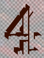
Next I inserted the Channel 4 logo into my print advert and resized it to fit the codes and conventions of other Channel 4 print adverts. I edited the channel 4 logo to fit the topic of the print advert and added drips of chocolate from parts of the "4".
After adding the logo I created 2 boxes using the shape tool and coloured these to match the colour of the logo. I did this so that the advert followed conventions.
Finally, using the Text tool I text into the boxes and positioned these to follow convention with the name of the documentary on the bottom line with the scheduling.


No comments:
Post a Comment